AI 차트 및 그래픽 생성기
막대차트부터 히트맵까지, 출판 품질의 차트/시각 스토리를 즉시 생성 - AI가 디자인 최적화
데이터를 설득력 있는 시각 스토리로 빠르게 전환하세요. 원하는 내용을 설명하면 AI가 적절한 차트 유형을 선택하고 색상·레이아웃을 최적화해 전문 시각화를 몇 초 안에 생성합니다.
What is AI 차트 및 그래픽 생성기?
데이터를 설득력 있는 시각 스토리로 빠르게 전환하세요. 원하는 내용을 설명하면 AI가 적절한 차트 유형을 선택하고 색상·레이아웃을 최적화해 전문 시각화를 몇 초 안에 생성합니다.
TabliSync 소개: AI 기반 Excel 자동화
실제 비즈니스 워크플로, 데이터 작업, 팀 협업을 위해 설계된 지능형 자동화 레이어입니다.
자연어 차트 생성
원하는 것을 간단히 설명하세요: '지역별 판매를 보여주는 막대 차트 만들기' 또는 '시장 점유율 원형 차트 생성' - AI가 즉시 만듭니다.
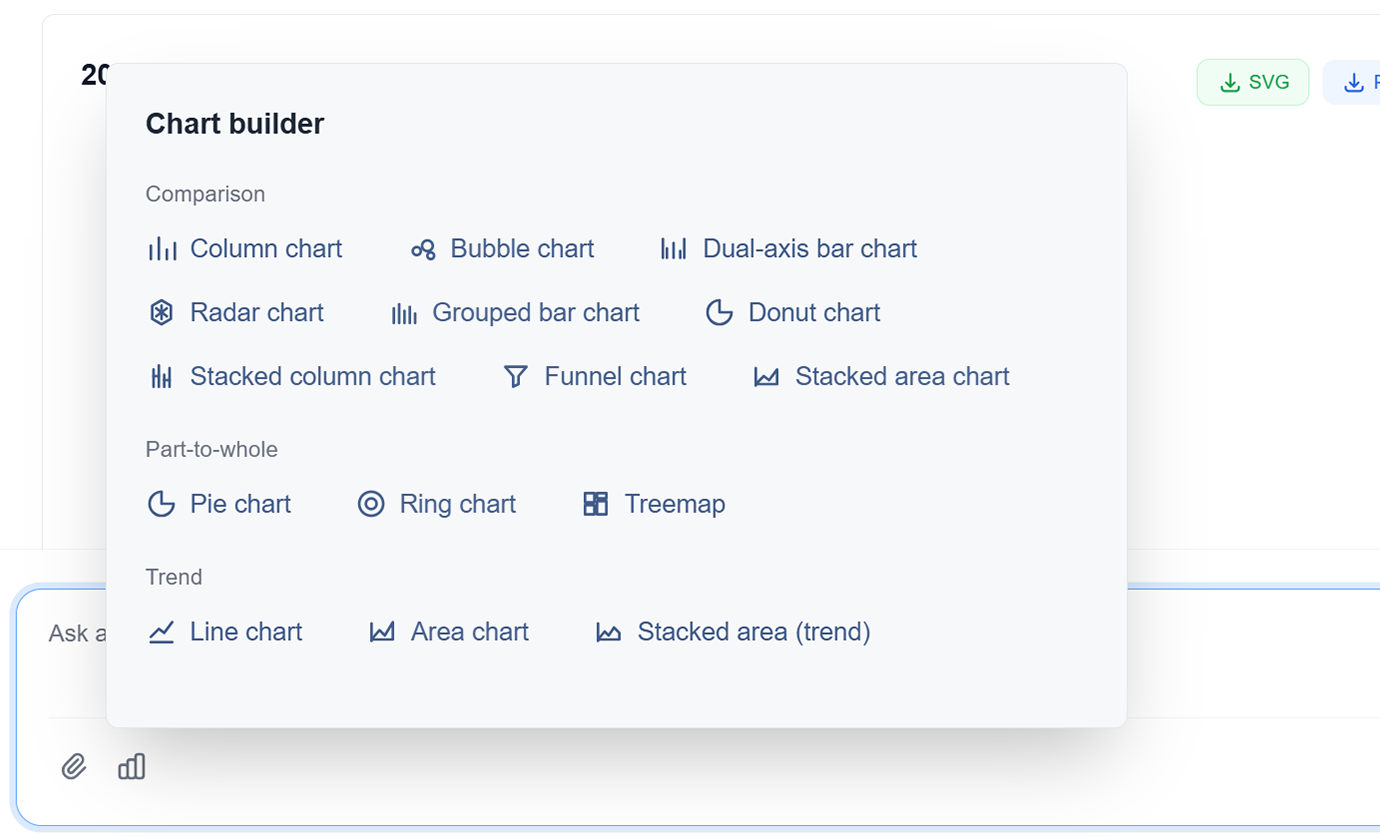
고급 차트 유형
막대 차트, 선 그래프, 원형 차트, 산점도, 히트맵, 트리맵 등에서 선택합니다. AI가 데이터에 가장 적합한 유형을 권장합니다.
AI 기반 디자인
AI가 최대 명확성 및 영향을 위해 색상, 레이블 및 레이아웃을 자동으로 최적화합니다. 디자인 기술 없이 전문 디자인.
대화형 시각화
호버 효과, 필터 및 드릴다운 기능이 있는 대화형 차트를 만듭니다. 동적 데이터 탐색으로 청중을 참여시킵니다.
데이터 스토리텔링
AI가 순차적 시각화 및 내러티브 흐름을 통해 데이터로 설득력 있는 스토리를 전달하도록 돕습니다. 데이터를 행동을 촉진하는 인사이트로 전환합니다.
다중 형식 내보내기
차트를 PNG, SVG, PDF로 내보내거나 프레젠테이션 및 보고서에 직접 포함합니다. 모든 사용 사례에 대한 고해상도 출력.
자연어 차트 생성
원하는 것을 간단히 설명하세요: '지역별 판매를 보여주는 막대 차트 만들기' 또는 '시장 점유율 원형 차트 생성' - AI가 즉시 만듭니다.
고급 차트 유형
막대 차트, 선 그래프, 원형 차트, 산점도, 히트맵, 트리맵 등에서 선택합니다. AI가 데이터에 가장 적합한 유형을 권장합니다.
AI 기반 디자인
AI가 최대 명확성 및 영향을 위해 색상, 레이블 및 레이아웃을 자동으로 최적화합니다. 디자인 기술 없이 전문 디자인.
대화형 시각화
호버 효과, 필터 및 드릴다운 기능이 있는 대화형 차트를 만듭니다. 동적 데이터 탐색으로 청중을 참여시킵니다.
데이터 스토리텔링
AI가 순차적 시각화 및 내러티브 흐름을 통해 데이터로 설득력 있는 스토리를 전달하도록 돕습니다. 데이터를 행동을 촉진하는 인사이트로 전환합니다.
다중 형식 내보내기
차트를 PNG, SVG, PDF로 내보내거나 프레젠테이션 및 보고서에 직접 포함합니다. 모든 사용 사례에 대한 고해상도 출력.
TabliSync 데모: 실제 동작 보기
TabliSync가 복잡한 워크플로를 몇 분 안에 간단한 자동화 프로세스로 바꾸는 모습을 확인하세요.
몇 초 만에 전문 시각화
수동으로 디자인하는 데 몇 시간이 걸리는 출판 품질의 차트 및 그래픽을 만듭니다. 몇 시간이 아닌 몇 초 만에 전문적인 결과를 얻습니다.
스마트 차트 권장 사항
AI가 데이터 및 인사이트에 가장 적합한 차트 유형을 자동으로 제안합니다. 막대 차트에서 히트맵까지 매번 완벽한 시각화를 얻습니다.
일관된 브랜딩
모든 차트는 일관된 색상, 글꼴 및 스타일로 브랜드 가이드라인을 따릅니다. 매번 감동을 주는 전문 시각화.
사용 전/후: TabliSync 변화
수동 워크플로와 지능형 자동화를 비교하고, 시간 절약과 오류 감소를 확인하세요.
기존 방식
기존 방식
- 수작업 단계가 많아 시간이 오래 걸림
- 팀원별 작업 방식이 일관되지 않음
- 데이터 누락과 입력 오류가 자주 발생
- 업데이트와 유지보수에 재작업 필요
- 업무가 커질수록 확장하기 어려움
TabliSync 사용 시
스마트한 방식
- AI로 반복 업무 자동화
- 표준화된 프로세스로 결과 일관성 확보
- 수작업 오류와 재작업 비용 감소
- 변경사항을 빠르게 반영
- 증가하는 업무량에도 유연하게 확장
작동 방식 - 간단한 시작 단계
시작하고 데이터 워크플로를 변환하는 간단한 단계
시각화 설명
자연어를 사용하여 원하는 차트 종류를 AI에게 알려주세요. 데이터, 차트 유형 및 스타일 선호도를 지정합니다.
AI 분석 및 생성
AI가 데이터를 처리하고 최적의 차트 유형을 선택하며 적절한 형식으로 전문 시각화를 생성합니다.
사용자 정의 및 개선
AI 지원으로 색상, 레이블 및 레이아웃을 미세 조정합니다. 특정 요구 사항에 맞는 완벽한 시각화를 얻습니다.
내보내기 및 공유
여러 형식으로 차트를 다운로드하거나 팀과 직접 공유합니다. 모든 청중을 위한 전문 시각화 준비.
시각화 설명
자연어를 사용하여 원하는 차트 종류를 AI에게 알려주세요. 데이터, 차트 유형 및 스타일 선호도를 지정합니다.
AI 분석 및 생성
AI가 데이터를 처리하고 최적의 차트 유형을 선택하며 적절한 형식으로 전문 시각화를 생성합니다.
사용자 정의 및 개선
AI 지원으로 색상, 레이블 및 레이아웃을 미세 조정합니다. 특정 요구 사항에 맞는 완벽한 시각화를 얻습니다.
내보내기 및 공유
여러 형식으로 차트를 다운로드하거나 팀과 직접 공유합니다. 모든 청중을 위한 전문 시각화 준비.
실제 성과: 고객 성공 사례
TabliSync로 매주 시간을 절약하는 팀과 전문가들의 피드백을 확인하세요.
"AI 차트 생성으로 프레젠테이션 퀄리티가 10배 좋아졌습니다."

Barbara Young
영업 이사
"디자이너가 아니지만 디자이너가 만든 것 같은 차트를 만듭니다."

Joseph King
비즈니스 분석가
"설득력 있는 시각화를 빠르고 쉽게 만들 수 있게 됐습니다."

Elizabeth Scott
마케팅 매니저
시나리오별 차트 제작
리뷰/발표/성과 추적을 위한 시각적 스토리 구성.
비즈니스 분석가
인사이트를 효과적으로 전달하는 비즈니스 보고서, 프레젠테이션 및 경영진 요약을 위한 설득력 있는 시각화를 만듭니다.
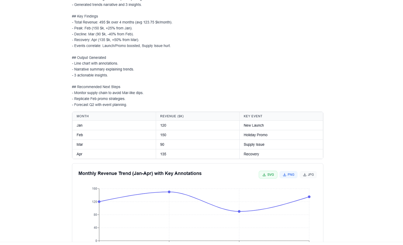
영업 성과 대시보드
시장 추세 분석 차트
KPI 추적 시각화
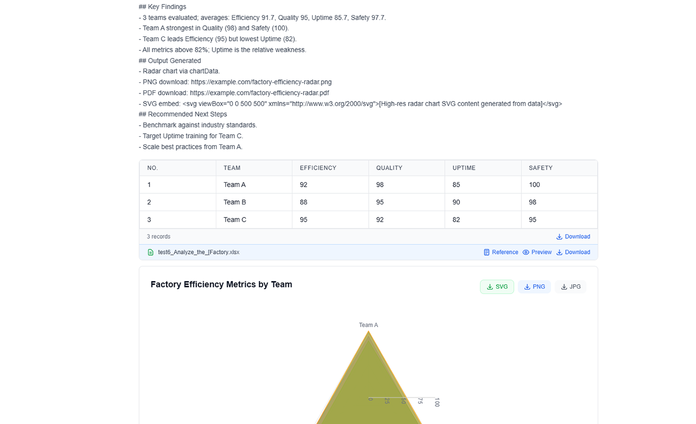
데이터 과학자
탐색적 데이터 분석 시각화를 생성하고 명확하고 전문적인 차트로 이해 관계자에게 결과를 전달합니다.
통계 분석 플롯
상관 관계 히트맵
분포 시각화
마케팅 팀
전략 계획을 위한 캠페인 성과 시각화, 고객 여정 맵 및 시장 세분화 차트를 만듭니다.
캠페인 성과 지표
고객 행동 퍼널
시장 점유율 분석
교육자
학생 및 학습자가 복잡한 개념을 쉽게 이해할 수 있도록 하는 교육 차트 및 다이어그램을 생성합니다.
개념 설명 다이어그램
통계 개념 일러스트레이션
대화형 학습 시각화
자주 묻는 질문
이 기능에 대해 자주 묻는 질문과 사용 방법, 기대할 수 있는 결과를 확인하세요.
TabliSync는 업로드된 차트 소스 데이터를 어떻게 안전하고 기밀적으로 보장하나요?
차트 생성 입력은 암호화 연결과 workspace 수준 권한으로 처리됩니다. 승인된 사용자만 시각화와 소스 데이터에 접근할 수 있습니다.
자연어 프롬프트로 스프레드시트 데이터에서 차트를 생성하려면?
전달하려는 스토리를 설명하고 데이터 범위를 선택한 뒤, AI가 차트 기준선을 선택하게 하세요. 공유 전에 시각화를 미세 조정할 수 있습니다.
KPI 트렌드와 차이 보고에 가장 적합한 차트 유형은?
꺾은선형 차트는 트렌드 변화에 적합하며, 그룹 막대형 차트와 폭포형 시각화는 인접 기간 간 차이를 더 잘 설명합니다.
AI가 경영 프레젠테이션을 위한 더 나은 차트 디자인을 제안할 수 있나요?
네. 계층, 레이블, 강조점을 최적화해 명확성을 높이고 의사결정 중심 프레젠테이션의 시각적 노이즈를 줄일 수 있습니다.
생성된 시각화를 주간 정기 보고에 재사용할 수 있나요?
네. 차트 템플릿을 재사용하고 업데이트된 데이터로 교체해, 정기 보고를 일관되고 더 빠르게 만들 수 있습니다.
자동 생성 차트에서 오해의 소지가 있는 시각 결과를 피하려면?
명확한 지표 정의를 사용하고, 축 눈금을 확인하며, 게시 전 세분화 필터를 검토하세요. 인사이트를 더 해석 가능하고 신뢰할 수 있게 만듭니다.
데이터 워크플로를 변환할 준비가 되셨나요?
데이터 요구 사항을 위해 TabliSync를 신뢰하는 수천 명의 전문가에 합류하세요
신용카드 불필요 • 매일 데이터를 동기화하는 10,000+ 사용자와 함께하세요