AI Charts & Graphics Generator: Create Professional Data Visualizations from Natural Language
Generate Publication-Quality Charts, Graphs & Visual Stories Instantly - Bar Charts to Heatmaps with AI-Powered Design
Transform your data into stunning visual stories effortlessly! Our AI creates professional, publication-ready visualizations from simple English descriptions. No design skills needed - just describe what you want and AI selects the perfect chart type, optimizes colors and layout, and generates beautiful graphics. Get professional visualizations in seconds that would take hours to design manually.
What is AI Charts & Graphics Generator: Create Professional Data Visualizations from Natural Language?
Transform your data into stunning visual stories effortlessly! Our AI creates professional, publication-ready visualizations from simple English descriptions. No design skills needed - just describe what you want and AI selects the perfect chart type, optimizes colors and layout, and generates beautiful graphics. Get professional visualizations in seconds that would take hours to design manually.
Excel Default Chart Design and Visual Appeal
Default Excel charts look unprofessional and require design expertise. Teams spend more time formatting visuals than analyzing data insights.
Excel Default Chart Design and Visual Appeal
Default Excel charts look unprofessional and fail to engage audiences in presentations and reports. Poor chart design reduces the impact of data insights and makes it harder to communicate findings effectively to stakeholders and clients.
This workflow bottleneck impacts team productivity, increases operational costs, and creates data quality issues that affect business decisions.
Data Visualization Skills and Design Expertise Gap
Creating compelling data visualizations requires design skills most business teams don't have. Without proper training, teams produce cluttered, confusing charts that obscure insights rather than illuminate them, reducing communication effectiveness.
Manual processes lead to inconsistent results, higher error rates, and frustrated team members who spend time on repetitive low-value tasks.
Chart Formatting Time vs Analysis Time Imbalance
Teams spend more time formatting charts—adjusting colors, fonts, labels, and layouts—than actually analyzing data. This chart formatting overhead reduces productivity and prevents teams from focusing on extracting actionable business insights.
Without automation, scaling operations becomes difficult, team efficiency suffers, and valuable time is lost on tasks that could be automated.
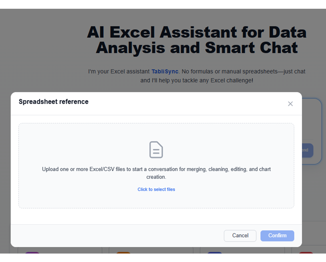
Meet TabliSync: Your AI-Powered Excel Automation Solution
An intelligent spreadsheet automation layer built on top of Microsoft Excel — designed for real-world business workflows, data processing tasks, and team collaboration. Transform manual Excel operations into automated, AI-driven processes that save time and reduce errors.
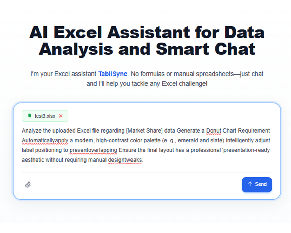
Natural Language Chart Creation
Simply describe what you want: 'Create a bar chart showing sales by region' or 'Generate a pie chart of market share' - AI creates it instantly.
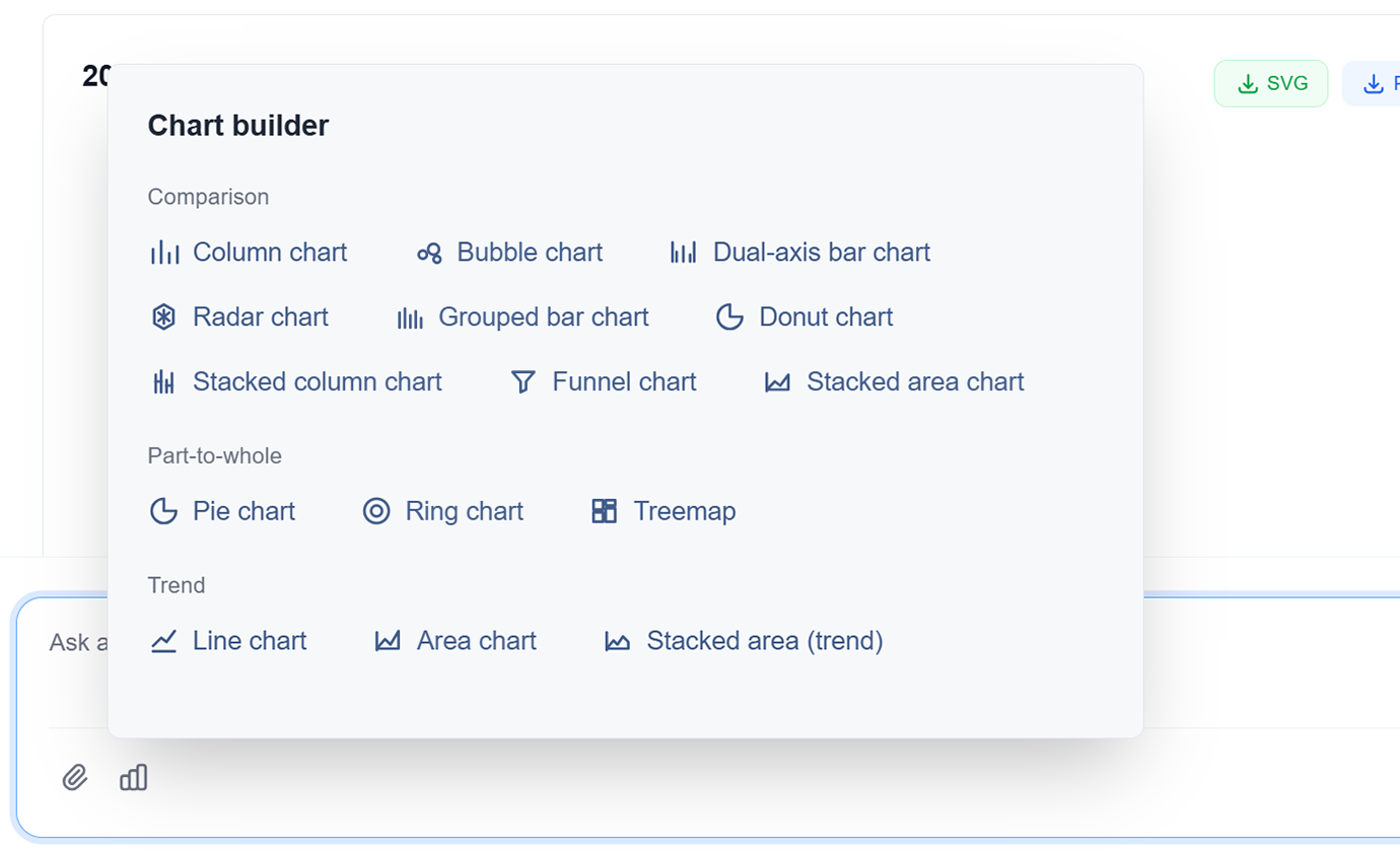
Advanced Chart Types
Choose from bar charts, line graphs, pie charts, scatter plots, heatmaps, treemaps, and more. AI recommends the best type for your data.
AI-Powered Design
AI automatically optimizes colors, labels, and layout for maximum clarity and impact. Professional design without the design skills.
Interactive Visualizations
Create interactive charts with hover effects, filters, and drill-down capabilities. Engage your audience with dynamic data exploration.
Data Storytelling
AI helps you tell compelling stories with your data through sequential visualizations and narrative flow. Turn data into insights that drive action.
Multi-Format Export
Export charts as PNG, SVG, PDF, or embed directly in presentations and reports. High-resolution outputs for any use case.
Natural Language Chart Creation
Simply describe what you want: 'Create a bar chart showing sales by region' or 'Generate a pie chart of market share' - AI creates it instantly.
Advanced Chart Types
Choose from bar charts, line graphs, pie charts, scatter plots, heatmaps, treemaps, and more. AI recommends the best type for your data.
AI-Powered Design
AI automatically optimizes colors, labels, and layout for maximum clarity and impact. Professional design without the design skills.
Interactive Visualizations
Create interactive charts with hover effects, filters, and drill-down capabilities. Engage your audience with dynamic data exploration.
Data Storytelling
AI helps you tell compelling stories with your data through sequential visualizations and narrative flow. Turn data into insights that drive action.
Multi-Format Export
Export charts as PNG, SVG, PDF, or embed directly in presentations and reports. High-resolution outputs for any use case.
See TabliSync In Action: Live Product Demo
Watch how TabliSync transforms complex spreadsheet workflows into simple, automated processes in just minutes. See real-world examples of data extraction, automation, and intelligent processing that save teams hours every week.
Professional Visualizations in Seconds
Create publication-quality charts and graphics that would take hours to design manually. Get professional results in seconds, not hours.
Smart Chart Recommendations
AI automatically suggests the best chart type for your data and insights. From bar charts to heatmaps, get the perfect visualization every time.
Consistent Branding
Every chart follows your brand guidelines with consistent colors, fonts, and styling. Professional visualizations that impress every time.
Before vs After: The TabliSync Transformation
Compare traditional manual workflows with TabliSync's intelligent automation. See how teams eliminate hours of repetitive work, reduce errors, and accelerate their data processing with AI-powered spreadsheet tools that actually work.
Traditional Way
The old way of working
- Ugly default Excel charts
- Requires design skills
- Time-consuming formatting
- Inconsistent styles
- Manual updates
With TabliSync
The smart way forward
- Professional AI-generated charts
- No design skills needed
- Instant creation
- Consistent branding
- Automatic updates
How It Works - Simple Steps to Get Started
Simple steps to get started and transform your data workflow
Describe your visualization
Tell AI what kind of chart you want using natural language. Specify the data, chart type, and any styling preferences.
AI analyzes and creates
AI processes your data, selects the optimal chart type, and generates a professional visualization with proper formatting.
Customize and refine
Fine-tune colors, labels, and layout with AI assistance. Get the perfect visualization for your specific needs.
Export and share
Download your chart in multiple formats or share directly with your team. Professional visualizations ready for any audience.
Real Results from Real Teams: Customer Success Stories
Don't just take our word for it. Hear from teams and professionals who are already saving hours every week with TabliSync. Real feedback from users who've transformed their spreadsheet workflows and reclaimed valuable time.
"Our presentations look 10x more professional with AI-generated charts."

Barbara Young
Sales Director
"I'm not a designer, but my charts look like they were made by one."

Joseph King
Business Analyst
"Creating compelling visuals is finally fast and easy."

Elizabeth Scott
Marketing Manager
Charting Use Cases by Scenario
Build clear visual stories for reviews, presentations, and performance tracking.
Business Analysts
Create compelling visualizations for business reports, presentations, and executive summaries that communicate insights effectively.
Sales performance dashboards
Market trend analysis charts
KPI tracking visualizations
Data Scientists
Generate exploratory data analysis visualizations and communicate findings to stakeholders with clear, professional charts.
Statistical analysis plots
Correlation heatmaps
Distribution visualizations
Marketing Teams
Create campaign performance visualizations, customer journey maps, and market segmentation charts for strategic planning.
Campaign performance metrics
Customer behavior funnels
Market share analysis
Educators
Generate educational charts and diagrams that make complex concepts easy to understand for students and learners.
Concept explanation diagrams
Statistical concept illustrations
Interactive learning visualizations
Frequently Asked Questions: Everything You Need to Know
Get answers to common questions about this TabliSync feature, including how to use it effectively, what results to expect, and how it integrates with your existing workflows. Find the information you need to get started with confidence.
How can I create charts from spreadsheet data using natural language prompts?
Describe the story you want to show, select the data range, and let AI choose a chart baseline. You can refine the visual before sharing.
What is the best chart type for KPI trend and variance reporting?
Line charts are effective for trend movement, while grouped bars and waterfall-style visuals help explain period-over-period variance.
Can AI suggest better chart design for executive presentations?
Yes. It can optimize hierarchy, labels, and emphasis to improve clarity and reduce visual noise in decision-focused presentations.
Can generated visuals be reused across recurring weekly reports?
Yes. You can reuse chart templates and update them with refreshed data so recurring reporting remains consistent and fast.
How do I avoid misleading visuals when auto-generating charts?
Use clear metric definitions, verify axis scales, and review segment filters before publishing. This keeps insights interpretable and trustworthy.
How does TabliSync keep uploaded chart source data secure and confidential?
Chart-generation inputs are handled over encrypted connections with workspace-level permissions. Access to visuals and source data is limited to authorized users.
Ready to Transform Your Data Workflow?
Join thousands of professionals who trust TabliSync for their data needs
No credit card required • Join 10,000+ users syncing data daily