AI 圖表與視覺生成器:用自然語言建立專業資料視覺化
從長條圖到熱圖,快速產出可發表等級的圖表與資料故事——由 AI 協助完成設計優化
把資料快速轉成有說服力的視覺故事。只要描述想呈現的重點,AI 就會自動選擇適合的圖表型態、優化配色與版面,幾秒內產出專業視覺化成果,適用於簡報、報表與對外溝通。
What is AI 圖表與視覺生成器:用自然語言建立專業資料視覺化?
把資料快速轉成有說服力的視覺故事。只要描述想呈現的重點,AI 就會自動選擇適合的圖表型態、優化配色與版面,幾秒內產出專業視覺化成果,適用於簡報、報表與對外溝通。
認識 TabliSync:AI 驅動的 Excel 自動化方案
在 Microsoft Excel 之上建立的智慧自動化層,專為真實商務流程、資料處理任務與團隊協作設計。把繁瑣的手動 Excel 操作變成可重複、可擴展的 AI 自動化流程,節省時間並降低錯誤。
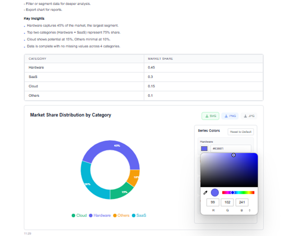
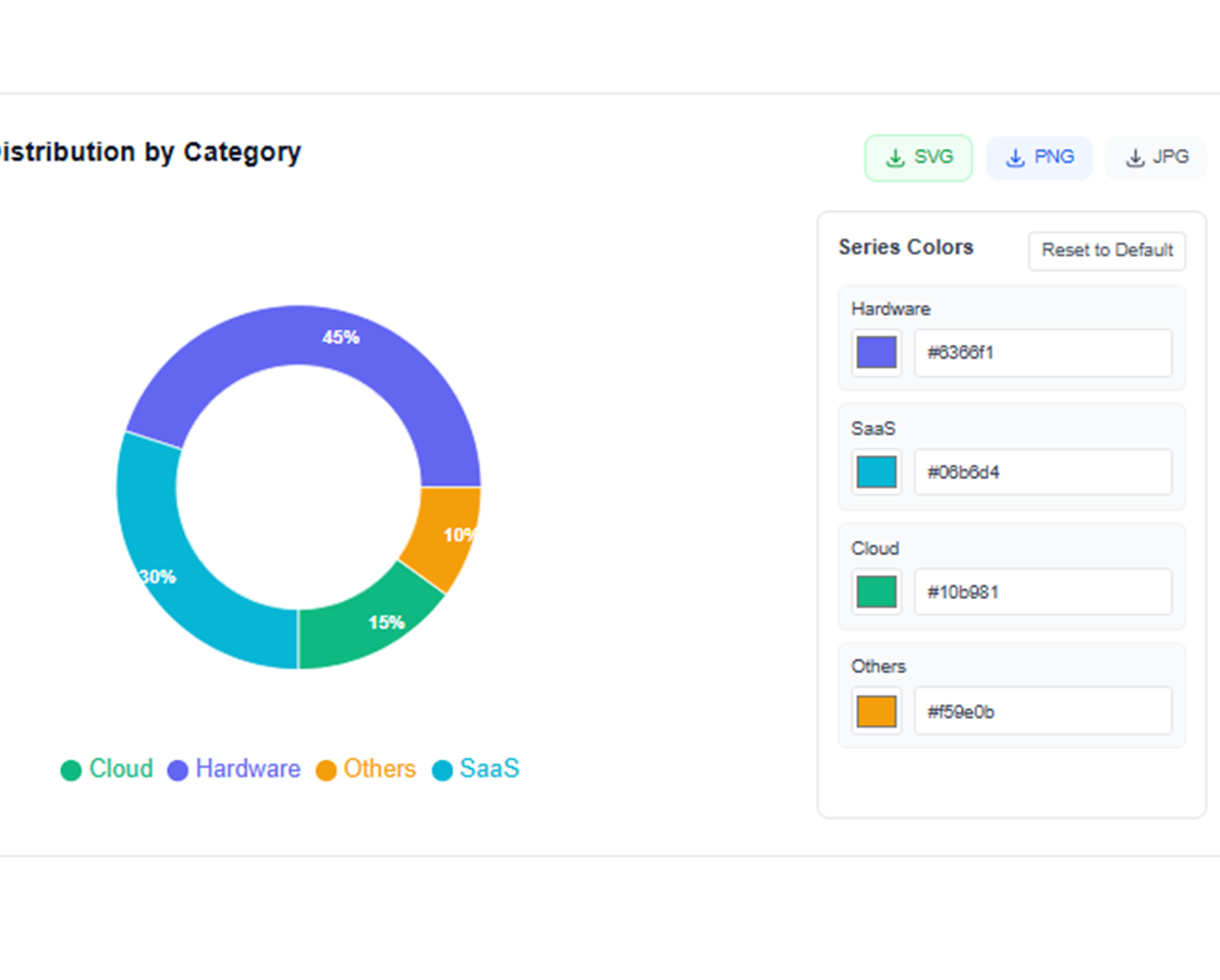
自然語言圖表建立
只需描述您想要的:「建立顯示各地區銷售額的長條圖」或「生成市場佔有率圓餅圖」——AI 立即建立。
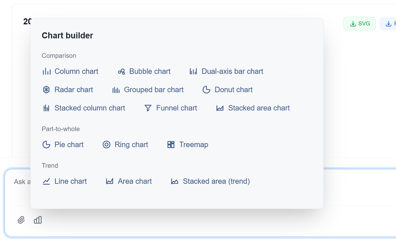
進階圖表類型
從長條圖、折線圖、圓餅圖、散佈圖、熱圖、樹狀圖等中選擇。AI 為您的資料推薦最佳類型。
AI 驅動設計
AI 自動優化顏色、標籤和版面,以獲得最大清晰度和影響力。無需設計技能的專業設計。
互動式視覺化
建立具有懸停效果、篩選器和向下鑽取功能的互動式圖表。透過動態資料探索吸引您的觀眾。
資料敘事
AI 透過順序視覺化和敘事流程幫助您用資料講述引人注目的故事。將資料轉化為推動行動的洞見。
多格式匯出
將圖表匯出為 PNG、SVG、PDF,或直接嵌入簡報和報表。適用於任何使用情境的高解析度輸出。
自然語言圖表建立
只需描述您想要的:「建立顯示各地區銷售額的長條圖」或「生成市場佔有率圓餅圖」——AI 立即建立。
進階圖表類型
從長條圖、折線圖、圓餅圖、散佈圖、熱圖、樹狀圖等中選擇。AI 為您的資料推薦最佳類型。
AI 驅動設計
AI 自動優化顏色、標籤和版面,以獲得最大清晰度和影響力。無需設計技能的專業設計。
互動式視覺化
建立具有懸停效果、篩選器和向下鑽取功能的互動式圖表。透過動態資料探索吸引您的觀眾。
資料敘事
AI 透過順序視覺化和敘事流程幫助您用資料講述引人注目的故事。將資料轉化為推動行動的洞見。
多格式匯出
將圖表匯出為 PNG、SVG、PDF,或直接嵌入簡報和報表。適用於任何使用情境的高解析度輸出。
實際看看 TabliSync:產品示範
看看 TabliSync 如何在幾分鐘內把複雜的試算表流程變成簡單自動化。透過真實案例了解資料擷取、工作流自動化與智慧處理如何每週節省數小時。
幾秒內建立專業視覺化
建立手動設計需要數小時的出版品質圖表和圖形。在幾秒內獲得專業結果,而非數小時。
智慧圖表建議
AI 自動為您的資料和洞見建議最佳圖表類型。從長條圖到熱圖,每次都能獲得完美的視覺化。
一致的品牌形象
每個圖表都遵循您的品牌指南,具有一致的顏色、字體和樣式。每次都能呈現令人印象深刻的專業視覺化。
使用前 vs 使用後:TabliSync 帶來的轉變
比較傳統手動流程與 TabliSync 的智慧自動化。看看團隊如何減少重複工作、降低錯誤,並用真正能落地的 AI 試算表工具加速資料處理。
傳統方式
傳統做法
- 大量手動操作,流程耗時
- 跨人員執行標準不一致
- 容易出現資料錯誤與遺漏
- 更新維護需要反覆重工
- 很難隨業務成長擴展
運作方式 - 簡單上手四步驟
開始並轉型您的資料工作流程的簡單步驟
描述您的視覺化
用自然語言告訴 AI 您想要什麼樣的圖表。指定資料、圖表類型和任何樣式偏好。
AI 分析並建立
AI 處理您的資料,選擇最佳圖表類型,並生成具有適當格式的專業視覺化。
客製化並調整
在 AI 協助下微調顏色、標籤和版面。為您的特定需求獲得完美的視覺化。
匯出並分享
以多種格式下載您的圖表或直接與您的團隊分享。準備好適用於任何觀眾的專業視覺化。
描述您的視覺化
用自然語言告訴 AI 您想要什麼樣的圖表。指定資料、圖表類型和任何樣式偏好。
AI 分析並建立
AI 處理您的資料,選擇最佳圖表類型,並生成具有適當格式的專業視覺化。
客製化並調整
在 AI 協助下微調顏色、標籤和版面。為您的特定需求獲得完美的視覺化。
匯出並分享
以多種格式下載您的圖表或直接與您的團隊分享。準備好適用於任何觀眾的專業視覺化。
真實成果:客戶成功故事
別只聽我們說。看看已經用 TabliSync 每週節省好幾小時的團隊與專業人士怎麼說。來自真實用戶的回饋,分享他們如何找回寶貴時間。
"有了 AI 產圖,我們的簡報專業度提升了 10 倍。"

Barbara Young
銷售總監
"我不是設計師,但做出的圖表看起來像專業設計。"

Joseph King
商業分析師
"做出有說服力的視覺化終於變得又快又簡單。"

Elizabeth Scott
行銷經理
各情境的圖表製作
為回顧、簡報與績效追蹤建立清晰的視覺敘事。
商業分析師
為商業報表、簡報和高階主管摘要建立引人注目的視覺化,有效傳達洞見。
銷售績效儀表板
市場趨勢分析圖表
KPI 追蹤視覺化
資料科學家
生成探索性資料分析視覺化,並用清晰、專業的圖表向利害關係人傳達發現。
統計分析圖
相關性熱圖
分佈視覺化
行銷團隊
建立活動績效視覺化、客戶旅程地圖和市場細分圖表,用於策略規劃。
活動績效指標
客戶行為漏斗
市場佔有率分析
教育工作者
生成教育圖表和圖表,讓學生和學習者易於理解複雜概念。
概念解釋圖
統計概念插圖
互動式學習視覺化
常見問題:你需要知道的一切
取得關於這項 TabliSync 功能的常見問題解答,包括如何有效使用、可以期待的成果,以及如何整合到既有工作流程。
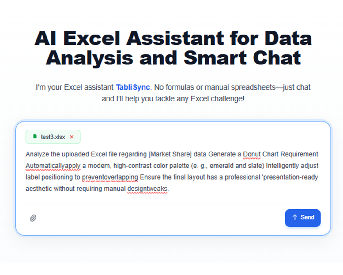
如何用自然語言提示詞,基於試算表資料生成圖表?
描述你想表達的故事、選擇資料範圍,並讓 AI 選擇圖表基線(chart baseline)。你可以在分享前先微調可視化效果。
用於 KPI 趨勢與差異(variance)報表,最適合的圖表類型是什麼?
折線圖很適合展示趨勢變化;而分組柱狀圖與瀑布式( waterfall )視覺能更好地解釋相鄰期間的差異。
AI 能為高管簡報建議更好的圖表設計嗎?
可以。它能優化層級、標籤與強調重點,提高清晰度並減少決策導向簡報中的視覺噪音。
生成的視覺化能否重複用在每週的例行報表中?
可以。你可以重用圖表模板,並用更新後的資料替換內容,讓例行報表能保持一致且更快產出。
自動生成圖表時,如何避免誤導性的視覺結果?
使用清晰的指標定義,核實座標軸刻度,並在發布前檢查分段篩選條件。這能讓洞察更具可解釋性且值得信任。
TabliSync 如何確保上傳的圖表來源資料安全且機密?
圖表生成輸入在加密連線下處理,並套用 workspace 層級權限。只有獲授權使用者可存取可視化與來源資料。