AIチャート&グラフィックス生成:自然言語からプロ品質のデータ可視化を作成
棒グラフからヒートマップまで、公開品質のチャートとビジュアルストーリーを即時生成 - AIが設計を最適化
データを説得力あるビジュアルストーリーへ変換します。自然言語で目的を伝えるだけで、AIが最適なチャート種別を選び、色とレイアウトを最適化し、プロ品質の可視化を数秒で生成します。
What is AIチャート&グラフィックス生成:自然言語からプロ品質のデータ可視化を作成?
データを説得力あるビジュアルストーリーへ変換します。自然言語で目的を伝えるだけで、AIが最適なチャート種別を選び、色とレイアウトを最適化し、プロ品質の可視化を数秒で生成します。
TabliSync:AIでExcel作業を自動化
実務のワークフロー、データ処理、チーム協業のために設計されたインテリジェントな自動化レイヤーです。
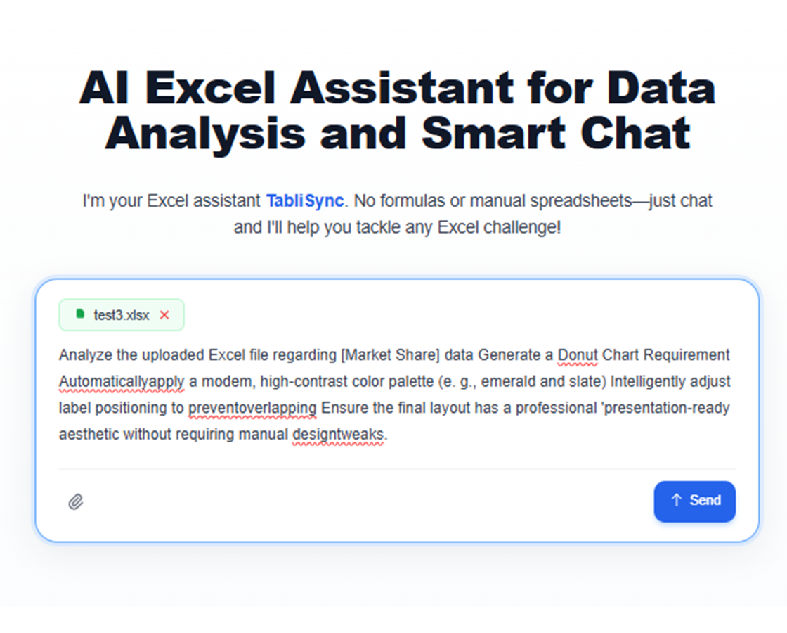
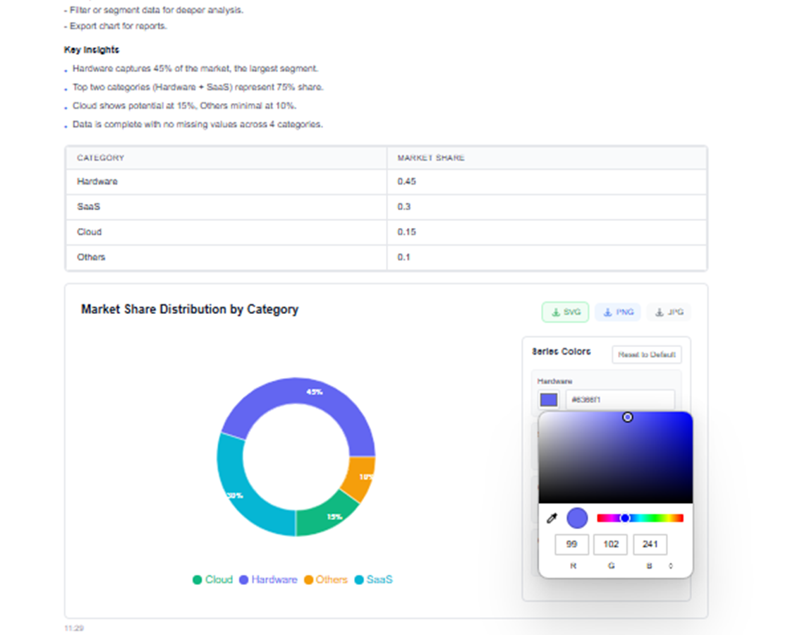
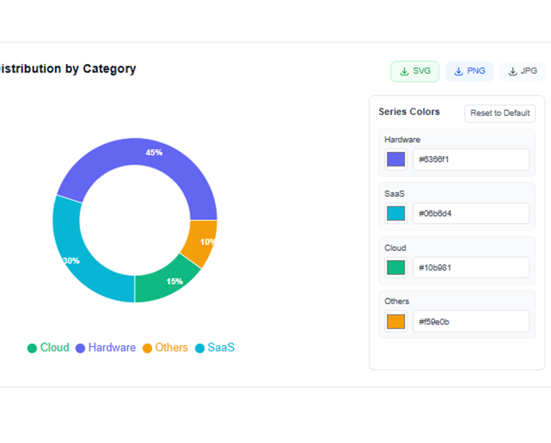
自然言語チャート作成
「地域別売上を示す棒グラフを作成」や「市場シェアの円グラフを生成」など、欲しいものを説明するだけ - AI が即座に作成します。
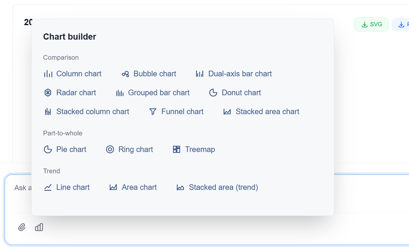
高度なチャートタイプ
棒グラフ、折れ線グラフ、円グラフ、散布図、ヒートマップ、ツリーマップなどから選択します。AI がデータに最適なタイプを推奨します。
AI 搭載デザイン
AI が最大の明瞭性とインパクトのために色、ラベル、レイアウトを自動的に最適化します。デザインスキルなしでプロフェッショナルなデザイン。
インタラクティブな可視化
ホバー効果、フィルター、ドリルダウン機能を持つインタラクティブなチャートを作成します。動的なデータ探索でオーディエンスを引き付けます。
データストーリーテリング
AI がシーケンシャルな可視化とナラティブフローでデータを使用して説得力のあるストーリーを語るのを支援します。データをアクションを促進するインサイトに変換します。
マルチフォーマットエクスポート
チャートを PNG、SVG、PDF としてエクスポートするか、プレゼンテーションやレポートに直接埋め込みます。あらゆる用途のための高解像度出力。
自然言語チャート作成
「地域別売上を示す棒グラフを作成」や「市場シェアの円グラフを生成」など、欲しいものを説明するだけ - AI が即座に作成します。
高度なチャートタイプ
棒グラフ、折れ線グラフ、円グラフ、散布図、ヒートマップ、ツリーマップなどから選択します。AI がデータに最適なタイプを推奨します。
AI 搭載デザイン
AI が最大の明瞭性とインパクトのために色、ラベル、レイアウトを自動的に最適化します。デザインスキルなしでプロフェッショナルなデザイン。
インタラクティブな可視化
ホバー効果、フィルター、ドリルダウン機能を持つインタラクティブなチャートを作成します。動的なデータ探索でオーディエンスを引き付けます。
データストーリーテリング
AI がシーケンシャルな可視化とナラティブフローでデータを使用して説得力のあるストーリーを語るのを支援します。データをアクションを促進するインサイトに変換します。
マルチフォーマットエクスポート
チャートを PNG、SVG、PDF としてエクスポートするか、プレゼンテーションやレポートに直接埋め込みます。あらゆる用途のための高解像度出力。
TabliSyncの動作を見る:製品デモ
複雑なワークフローが数分でシンプルな自動化プロセスに変わる様子をご覧ください。
数秒でプロフェッショナルな可視化
手動で設計するのに何時間もかかる出版品質のチャートとグラフィックスを作成します。何時間もではなく数秒でプロフェッショナルな結果を取得します。
スマートチャート推奨
AI がデータとインサイトに最適なチャートタイプを自動的に提案します。棒グラフからヒートマップまで、毎回完璧な可視化を取得します。
一貫したブランディング
すべてのチャートが一貫した色、フォント、スタイルでブランドガイドラインに従います。毎回感動を与えるプロフェッショナルな可視化。
Before / After:TabliSyncによる変化
手作業のフローと自動化を比較し、時間短縮とミス削減を確認できます。
従来のやり方
従来のやり方
- 手作業が多く時間がかかる
- 担当者ごとに運用がばらつく
- 入力ミスや抜け漏れが起きやすい
- 更新や保守で手戻りが発生する
- 業務拡大時にスケールしにくい
TabliSync を使う場合
スマートなやり方
- AI が繰り返し作業を自動化
- 運用を標準化し結果が安定
- 人的ミスと手戻りを削減
- 変更をすばやく反映可能
- 大規模運用にも対応しやすい
仕組み - 簡単な開始ステップ
開始してデータワークフローを変革するためのシンプルなステップ
可視化を説明
自然言語を使用して欲しいチャートのタイプを AI に伝えます。データ、チャートタイプ、スタイルの好みを指定します。
AI が分析して作成
AI がデータを処理し、最適なチャートタイプを選択し、適切なフォーマットでプロフェッショナルな可視化を生成します。
カスタマイズと調整
AI の支援で色、ラベル、レイアウトを調整します。特定のニーズに完璧な可視化を取得します。
エクスポートと共有
複数の形式でチャートをダウンロードするか、チームと直接共有します。あらゆるオーディエンスに対応したプロフェッショナルな可視化。
可視化を説明
自然言語を使用して欲しいチャートのタイプを AI に伝えます。データ、チャートタイプ、スタイルの好みを指定します。
AI が分析して作成
AI がデータを処理し、最適なチャートタイプを選択し、適切なフォーマットでプロフェッショナルな可視化を生成します。
カスタマイズと調整
AI の支援で色、ラベル、レイアウトを調整します。特定のニーズに完璧な可視化を取得します。
エクスポートと共有
複数の形式でチャートをダウンロードするか、チームと直接共有します。あらゆるオーディエンスに対応したプロフェッショナルな可視化。
実際の成果:成功事例
TabliSyncで毎週時間を節約しているチームや専門家の声をご紹介します。
"AI生成チャートでプレゼンの見栄えが10倍良くなりました。"

Barbara Young
営業責任者
"私はデザイナーではありませんが、デザイナー制作のような品質です。"

Joseph King
ビジネスアナリスト
"説得力のある可視化を素早く簡単に作れるようになりました。"

Elizabeth Scott
マーケティングマネージャー
シナリオ別チャート作成
レビューやプレゼン向けに分かりやすい可視化を作成。
ビジネスアナリスト
ビジネスレポート、プレゼンテーション、エグゼクティブサマリーのための説得力のある可視化を作成し、インサイトを効果的に伝えます。
ビジネスパフォーマンスダッシュボード
市場トレンド分析チャート
KPI 追跡の可視化
データサイエンティスト
探索的データ分析の可視化を生成し、明確でプロフェッショナルなチャートで関係者に結果を伝えます。
統計分析チャート
相関ヒートマップ
分布の可視化
マーケティングチーム
戦略計画のためのキャンペーンパフォーマンスの可視化、カスタマージャーニーマップ、市場セグメンテーションチャートを作成します。
キャンペーンパフォーマンスメトリクス
顧客行動ファネル
市場シェア分析
教育者
学生や学習者が複雑な概念を理解しやすくする教育チャートと図を生成します。
概念説明図
統計概念の図解
インタラクティブな学習の可視化
よくある質問
この機能の使い方や期待できる結果、連携方法などのよくある質問にお答えします。
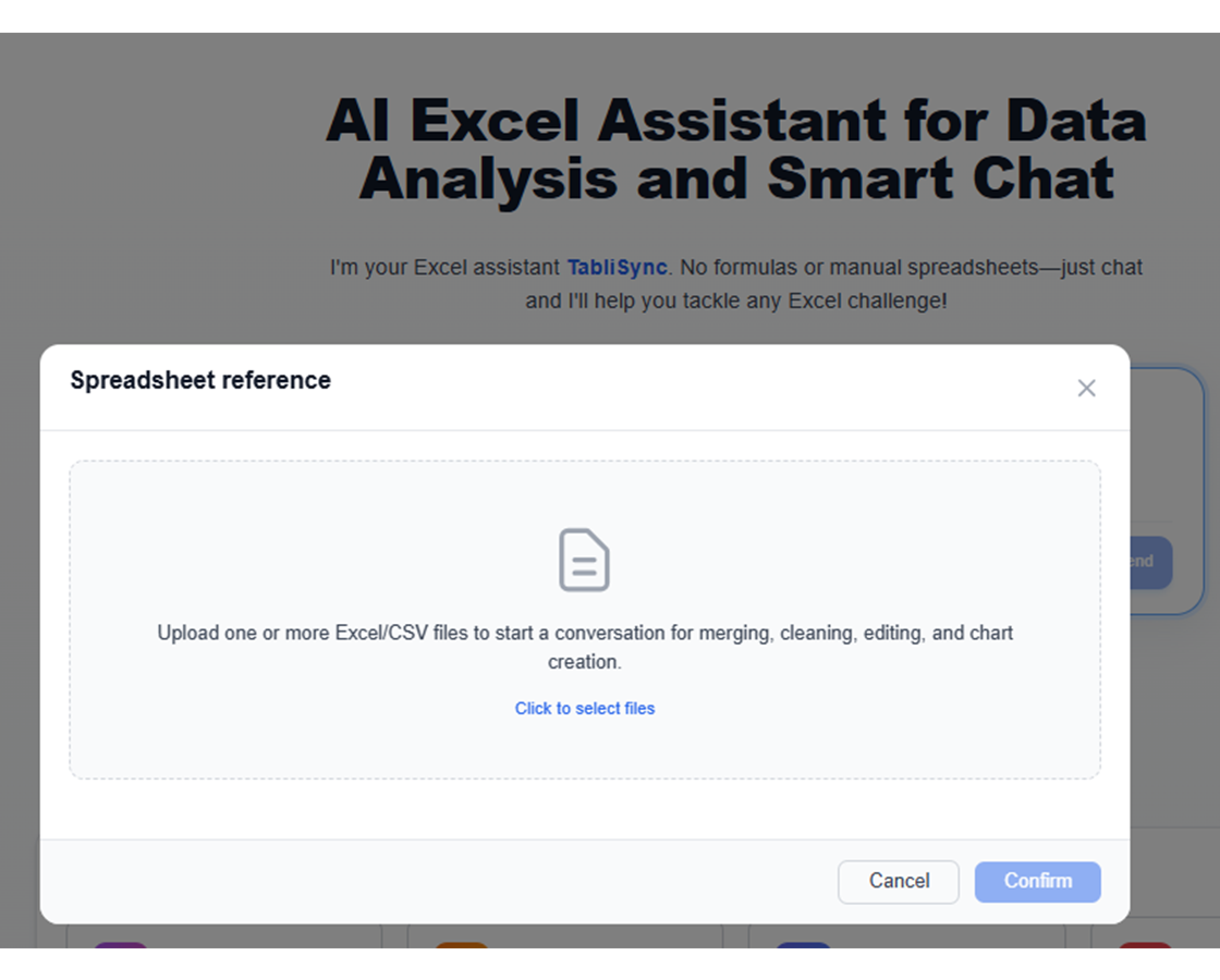
自然言語プロンプトでスプレッドシートデータからチャートを生成するには?
伝えたいストーリーを記述し、データ範囲を選択し、AI にチャートベースラインを選ばせます。共有前に可視化を微調整できます。
KPI トレンドと差異レポートに最適なチャートタイプは?
折れ線グラフはトレンド変化に適し、グループ化棒グラフとウォーターフォール可視化は隣接期間間の差異をよりよく説明します。
AI は経営プレゼン向けにより良いチャートデザインを提案できますか?
はい。階層、ラベル、強調点を最適化し、明瞭性を高め、意思決定志向プレゼンの視覚ノイズを減らせます。
生成された可視化を週次定例レポートに再利用できますか?
はい。チャートテンプレートを再利用し、更新データに差し替え、定例レポートを一貫かつ迅速に作成できます。
自動生成チャートで誤解を招く可視化結果を避けるには?
明確な指標定義を使用し、軸目盛を確認し、公開前にセグメントフィルターを検証してください。インサイトをより解釈可能で信頼できるものにします。
TabliSync はアップロードされたチャートソースデータをどのように安全かつ機密に保証しますか?
チャート生成入力は暗号化接続と workspace レベル権限で処理されます。承認済みユーザーのみが可視化とソースデータにアクセスできます。
データワークフローを変革する準備はできましたか?
データニーズに TabliSync を信頼する何千ものプロフェッショナルに参加しましょう
クレジットカード不要 • 毎日データを同期する10,000+ユーザーに参加